Showing posts with label concept art. Show all posts

9 Mar 2016

GIJOE Inspired Vehicle Design (and many thanks!)


So I'm imagining  GIJOE inspired vehicle to defeat the evil Cobra organisation, that  has developed a secret base on mars. GIJOE must take the fight to Cobra and venture to the red planet. Cobra’s HQ is deep into the core of the Martian planet, GIJOE must be equipped to get to Cobra and must be well armed for the battle about to ensue. And this is my take on it ! :] 


The vehicle toy would be fully equipped with spinning drill to get to the core of Mars. It would have an abundance of dart launchers and disk launchers to defeat the cobra, of course!  The front... bonnet (?) would open to place the figurine inside too. Og, and all the rockets and squeeze launchers would flip or push-fit inside for the 'shielded' drilling mode :D 


And here is some 3D development too. Just blocking out the shapes and breaking up into sections for (possibly) further modeling) Tried to maintain angular , mean shapes (Thanks for the advice Rich and Marius ! ) Also, in keeping with scorpion theme, went for rather over-sized rear (thanks to my sister for suggestion!) 


As a little behind the scenes, I've considered some of the existing GIJOE toys as well as reference of vehicle design for films such as Armagedon, Martian. But more inspiration came thinking about what could fight cobra as an equal opponent. Scorpions and mongoose (Thanks Jono!) ! I went with scorpion :] (Thanks to FZD and Tom for cool work that I got inspired by too)


Personally, I felt like this little design challenge was something out of my comfort zone, as I've never designed a vehicle...modeled one, as a tutorial (thanks Alan! )  But it was fun. I was pleasantly surprised it did come together. And a lot is down to some good advice from a fair few people too , many thanks to them.

Thank you for stopping by x


18 Jan 2013

Medeine, Baltic Goddess of the Forest


 Medeinė (derived from medis (tree) ), is one of the main deities in  Baltic mythology, She is a ruler of forests, trees and animals. Medeina is depicted as a young silver-haired woman and a she-wolf;  an unmarried beautiful huntress. Her duty is not to help the hunters, but to protect the forest.

For a long time I wanted to do a painting as resolved as this.Overall, I think it was an excellent exercise in illustration and not as much in character design. I paid particular attention to poses, composition and colour (a great challenge was to avoid  the generic blue-wash looks). Again, haven't used much reference here, only for the skin colour under moonlight.


 photo Medeina-goddess-GIF_zps47f2a1da.gif

Didn't have so much fun painting like this in ages! ((:]I hope next character from the Baltic Gods family, will be Telovelis...

7 Dec 2012

Drawing Fresh: Airship

I continue on exploring some totally new fields to me. This time big fat thanks to Tom, for encouraging me to try totally new approach of drawing! I can't recall if I ever even tried drawing an airship too. It has been fantastic day!


JJ.

3 Oct 2012

Evolved from Octopus : Air Pilot


As a follow up to previously uploaded sea creature paintings and studies, here is a character concept for the air pilot. the thought was to reimagine a human, who evolved from Octopus instead of chimpanzees. I used this little project to familiarise myself with male anatomy and muscles.


A bit about the logic behind it. I tried to introduce a bit of octopus anatomy to it. Much like an octopus, the pilot's scull is relatively flat. Jaw is wide and there is no high bridge between the eyes, instead the eyebrows take much thicker shapes . His arms and legs resemble octopus tentacles in that they have quite defined edging to it. The chest over all takes the a light bulb-kind of shape too.


19 Feb 2012

Vaiva's Concept Design


Baltic Pixies general portrayal is for the creatures to be quite sexy and inviting, yet brutal and dangerously animal-like. Their long hair is tangled,  rock-nails sharp, they have massive lips and breasts,  and chicken skin underneath straw-clothing. Some of them are  beautiful, with golden or white dresses, big eyes but nonetheless have the chicken skin and legs. But the queen of their kind, Vaiva, caries  some sophistication to her, mainly in the attire,  worthy of a queen. 


Other motifs include dragonflies and amber. 

Together with the background, which is a complimentary to the dominant character design colour, green, I tried to use full spectrum of color wheel. 

In my personal opinion, the design here is not the mind-cracking one, because this project seems to ask one not: quite familiar female character, with modest moderations to suggest chicken-woman and some fancy decorative costume design. 

I’m  in the between the idea that this is PRECISELY what I needed and can move to some detailed designs of hands, head and so on, or that maybe  should loosen up and give another attempt to get some potentially more interesting designs. 


22 Dec 2011

Evil Wolf's 3D Concept

the same routine follows again: I bring  3d render of evil wolf and a maquet environment to photoshop and play with things there to make some nice visual representation. Hopefully the "infinite" space is clearly drawn where  his "steam" goes.


 The Progress :


 I have developed the environment  in relatively good detail, but then had to take it back to bring up some theatrical lighting. Possibly these concepts can serve for our animation lighting ideas.


And that would be it from my side :] Time for some proper Christmas holidays :] Family finaly comes at my totaly empty student halls :D
Wish you merry Christmas! :]

Headmoore Painting

Im on holidays for both uni and work, so I finally got to finish this old idea. I got it actually... a year ago, while visiting friend in Amsterdam. Now it kind of fascinates me, that I captured it pretty close to the original vision. Some already noted that this piece seems unlikely to my style. Something fresh then, I guess...


Execution was very quick, everything seemed to fall into places withought much of trouble.But then again, it is only a sketchy painting. I guess the Italian approach of "working" in the head and thinking about an idea was what helped :D To create the feeling a driving decision was colour palette choise of 3 colours , two complimentary green and purple, and one which sits directly in the middle of them - bright yellow.

21 Dec 2011

Good Wolf's 3D Concept

I have read a while ago about this new approach artists are using for creating beautiful .. 3D Concepts. It involves making anything from making a quick 3D maquet to resolved 3d models and bringing them later to photoshop to push the visual idea there. This is my first attempt, the 3D concept of Good wolf.


I was trying to blend the the character in the scene seamlessly. I also used a more dynamic angle, so it made the task more interesting. Perhaps there is some conflict between the very defined 3D model of the wolf and very stylistic and relatively loose environment.


I’m hoping to do something similar for the Evil Wolf as well and then finally my family will arrive and it will be time for Christmas :]

27 Oct 2011

Soul Representation Concept

At Wolves Within  discussions lead to development of soul representation concept. This one combines ideas from three other dolls. Also, in Leo's concept I noticed he'd draw it white so I gave it a go and this prooved  to diminish the sinister qualities  "soul " designs  had before, but keeping still the misteriousness.


It was guided, as always, by the reference sheet of native american dolls


20 Oct 2011

'The Wolves Within' Development

 Character Fix

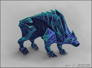
Tuesday was a day of feedback on wolf Characters. After discussion with Leo and Phil, I also talked to Justin Wyatt. In short, it was obvious designs needed some problem solving and revisiting.


 For the good one things seemed to go over the top:  decorativeness  and saturated in complimentary colours  were obfuscating the shapes. I've added some mass to his neck and change the 'face make-up' .A little nice touch, suggested by Leo, was to get rid of eye pupils.


In contrast , the bad wolf , presented other set of problems. Mainly regarding shapes of the back  part of the body and how it would work in animation. He was looking stiff as a statue figure. The challange was to figure out how he'd work. So I've come up with this idea, which was kind of evident in the design already, that the bad wolf is tied with an anti-matter/black matter which is holding him in place. So when he moves parts come together and distance away.
I added tail ( finally :D ) and fixed the spine line.


Wolf Terrain Suggestion

I thought to give it a go and create a suggestion of environment to express more clearly what kind of thought I have about it. I find it quite hard to describe it in words.


It is presented in flat view so we see the transitioning from the bad wolf 's affected  environment to the good ones. Also, keeping in mind it is a race from unconscious to conscious , I was imagining the environment would correspondingly  build from 'nothingness' to a fully crowded space.

This concept is also testing the idea for the environment to be quite desaturated in colour. Lighting would be quite colourful: Green (blues, violets) for the bad wolf , golden (whites, oranges) for the good one.


15 Feb 2011

The Outside World

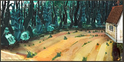
This is a concept of the environment which Ivan first explores and where he becomes a sky-lantern.
In this picture there is a house, a stripe-like field, also woods with "bushes" and at the last layer of composition a mountain.


 Stylization:  

The colour palette is suited to compliment Ivan, make him stand out. Both blues and creamy colours play as a background colour for Ivan's bright greens and browns.

All the elements are slightly off-scale and appear  2d  and illustrational. I was aiming to create a very fairy-tale-like environments.  This was inspired by fairy-tale books which have pop-up illustrations when you open the page. For example:


Also, I seem to forgot to upload the texture sheets I've drawn a while ago. I use them  for concepts and in future texturing. They are created using  water colours, pastels and water pencils


13 Feb 2011

The Workshop

This is Ivan's birth place. The workshop is a quite and a still place, where models seem to sleep or wait for their moment.

Cold, and dark but still enough cosy, from one respect, because I imagined that it is still a place where those models first got made, so it has to be "a good" place after all.


You should find  all sorts of stuff here . Tools, paper rolls, half built models, blueprints etc. 

19 Jan 2011

Narrative Project: The Last Week

Last week of studio experience just past away and here is the last update on activitys done throughout the time.

The week was busy with getting the last animations ( the ones which involved toymaker's character) done.
There were quite a few of them :
toymaker in production line scenes


The scene of Toymaker meeting  his creation :


When Animation was completed , I've concentrated on postproduction, that is compositting and editting.
Main changes done in after effects were to achieve a certain look and feel , whether it meant to add noise, increase exposure, animate glow. All the scenes had their colours tweaked, most of the time ading 4 colour gradient to add some variety in other wise quit simple looking scenes ( such as marching army shadow on field etc.)


Heavy editting is what our project relied uppon from the very beginning, and that is where I found myself for .. 3 days. Weird enough, towards the end of editting each time  I'd have a headache, what isn't usual to me at all , so perhaps  these subliminal shots and  speedy sequences really do effect somehow :D

Here is a taster of the final product, a teaser trailer :


Appart from that it was time to wrap the project up, so here are the designs of DVD cover and DVD disc:


Ant the actual painting suggests the story of film itself. The toy which was created to bring happynes and joy and  was an inactive shell, got invaded by alien content and became  lost and  threatening monster.


There will be one last post, an overview of the project and the trailer itself :)

30 Dec 2010

Dream Island...

For this artwork to be born I had to merge myself with a very dreamy mood. I was thinking about what ever  beautiful the whole time of painting ( about 1 and a half days) and found that this was a way to go into a very festive mood as well , (New Years tomorow!)  :)

This time I went for a new method, and so it started from designin separate props.  I've design Ivan's house, sails, wind-mills, lanterns, "trees"  before going into the whole concept of the Island.

When I was designing his house I tried to bring concepts of nesting-box, Chinese Lantern and incorporate elements from Ivan's design itself, so that the audience gets the feeling of the house  actually is bird's home. Also all the ideas had to flow into a  hand-crafted construct. I imagined, a kid had built it ( you should notice hand prints on the house).


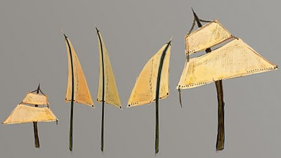
Sails are another element in the island. Here is the variation I used.


These are "trees" a surreal element which adds to the flavour of Dream island, since it's not as logical element ( like sails, wind-mills  or nesting-box).  The design is almost entirely taken from my previous graphics work Pixie.

There were some "touches" to fynalise the composition or direct attention in my  sketch. And today I found the obvious solution wind-mills. It suits the mood, shape and theme perfectly. Also in later stages of animation it will serve as that aditional little element which brings  Island to life.


So as posted previously everything started from composition resolution


With this chosen composition a more detailed sketch was resolved.


By starting from background I  roughed in  main shapes.


Then brought all the elements I had worked out before and placed it according to sketch.


Then textures...

Lighting, shadows, layering,  tweaking, ect.


In the second half of the whole painting process my  main concern was to direct attention corectly. Because theres so much happening here, it's so easy to be overwhelmed by fancy style. House should stand out. Also I don't know if I succseded, but didn't want the Island to feel completely flat, rather as i there is a cosy space just in the center.
I'm still not sure if all this is working, because, quite obviously it doesn't follow the rule, less is more :D And who knows, maybe it should...
Island is a symbol of dreams come true so  I tried to make it rich...